Why Your Website Looks Different on Your Phone (And Why That's a Problem)
Your website looks great on your computer. But have you checked it on your phone, on mobile data? Here's why that matters and what to do about it.

Quick answer
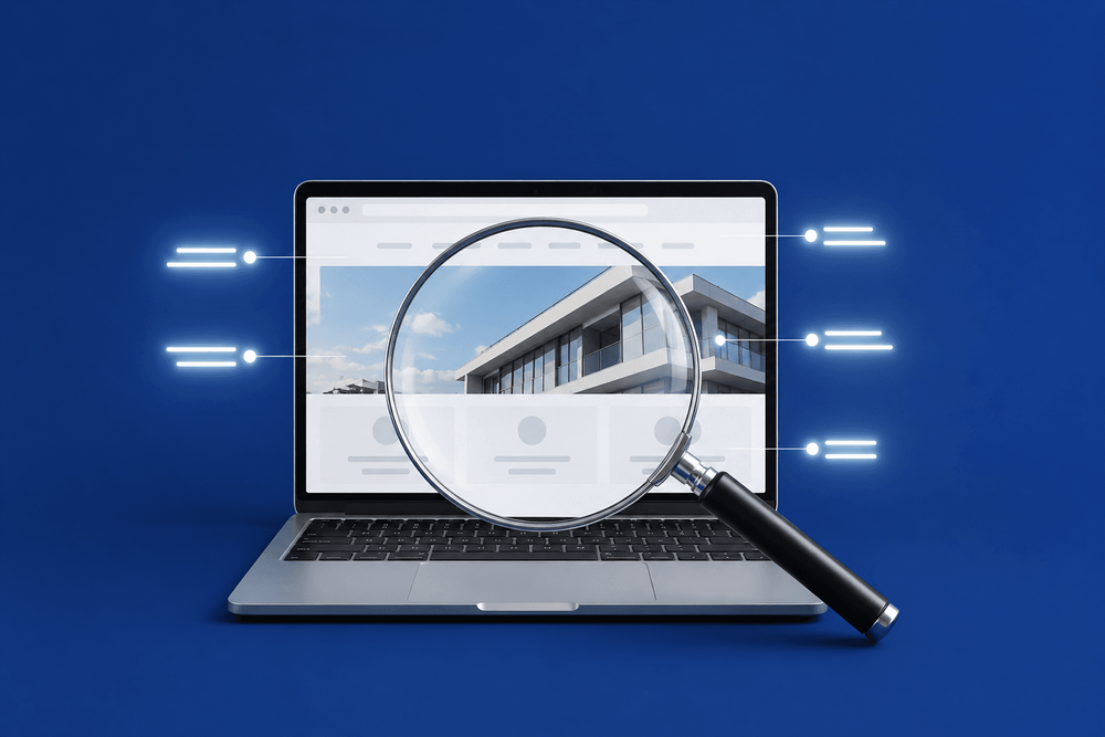
What "mobile friendly" actually means A mobile-friendly website isn't a separate version of your site for phones. It means your website automatically adjusts to fit whatever screen it's being viewed on - whether that's a...
Key takeaways
- What "mobile friendly" actually means
- Why your site looks fine to you but not to your customers
- What Google thinks about your mobile site
- How to check your site right now
What "mobile friendly" actually means
A mobile-friendly website isn't a separate version of your site for phones. It means your website automatically adjusts to fit whatever screen it's being viewed on - whether that's a desktop monitor, a tablet, or a smartphone.
In practical terms, it means text that's large enough to read without zooming in, buttons that are easy to tap with a thumb, images that fit the screen without forcing you to scroll sideways, and a layout that makes sense on a smaller display. If your visitors have to pinch, zoom, or scroll horizontally to use your site, it's not mobile friendly.
This isn't a nice-to-have feature. Over 60% of all website traffic now comes from mobile devices. For local businesses - people searching for a service while they're out and about - that number is often even higher.
Why your site looks fine to you but not to your customers
This is something we explain to almost every new client. You've been looking at your website on your office computer, on fast broadband, on a big screen. Everything looks great. But your customers are finding you on a phone, often on mobile data, while they're out and about. The site that looks perfect on your desktop can be slow, cramped, and frustrating on their phone. Until you check it the way they experience it, you don't really know how your site performs.
We've had clients tell us their site looks fine on mobile because they checked it a year ago. The problem is that their site hasn't changed, but their visitors' expectations have. What passed for mobile-friendly three or four years ago - slightly smaller text, the same layout just squeezed down - doesn't cut it anymore. Visitors expect a site that feels like it was designed for their phone, not adapted from a desktop as an afterthought.
The gap between what you see and what your customers see is one of the biggest blind spots in small business web design. And it's costing businesses customers every day without them realising it.
What Google thinks about your mobile site
Google now uses what's called mobile-first indexing. In plain English, this means Google looks at the mobile version of your website first when deciding where to rank you in search results - not the desktop version.
So even if your desktop site looks professional and loads quickly, if the mobile version is slow, hard to navigate, or missing content, your search rankings will suffer. Not just on mobile searches - on all searches. This has been the case since 2019, but many small business owners still don't realise it.
If you've been wondering why your site isn't showing up on Google as well as you'd expect, your mobile experience could be the reason. We covered more about how Google ranks small business sites in our post on whether small businesses actually need SEO.
How to check your site right now
We use a simple test with every client site: open it on your phone and try to do the three things a customer would do - find out what you offer, find your phone number, and get in touch. If any of those take more than a couple of taps, or if you have to pinch and zoom to read anything, your mobile experience needs work.
Do this on mobile data, not Wi-Fi. Your office Wi-Fi is probably much faster than the 4G connection your customers are using. The difference can be dramatic - a site that loads in two seconds on broadband might take six or seven on a mobile connection.
Then run your site through Google's free PageSpeed Insights tool. It scores your site out of 100 for both mobile and desktop. Most business owners have never done this, and the mobile score is almost always lower than they expect. A score below 50 on mobile means your site is genuinely struggling - and your visitors are feeling it.
Common problems and what to look for
When we review client sites on mobile, the same issues come up again and again. Here's what to check for on your own site:
Text that's too small to read without zooming in. Buttons or links that are too close together, making it easy to tap the wrong one. Images that overflow the screen or force sideways scrolling. A phone number that's displayed as plain text instead of a clickable link. Pages that take more than three or four seconds to load. Navigation menus that don't work properly on a touchscreen.
Any one of these can frustrate a visitor enough to leave. If your site has several of them, you're losing potential customers every day. Our guide on how to tell if your website is costing you customers covers more of the warning signs to watch for.
What to do about it
Some mobile problems are quick fixes - making a phone number clickable, resizing images, increasing font sizes. If your site is fundamentally responsive but has a few rough edges, these are things you or your developer can sort in an afternoon. We've listed some of these in our weekend fixes guide.
But if your site was built without mobile in mind - or was built on an old template that doesn't adapt to modern screens - patching individual issues won't be enough. At that point, a rebuild is usually the smarter investment.
Many of the worst mobile experiences we see come from older templates or page builders that were designed desktop-first and then "made responsive" as an afterthought. The layout technically fits on a phone, but the experience is poor - slow loading, oversized images, navigation that doesn't work properly with a thumb. If that sounds like your site, it's worth understanding why we don't use templates and what the alternative looks like.
Your customers are on their phones
This isn't a trend that's going away. Mobile traffic has been the majority for years and it's still growing. If your website doesn't work properly on a phone, you're not just missing out on some visitors - you're missing out on most of them.
The good news is that you can check right now. Open your site on your phone, run it through PageSpeed Insights, and try to do the three things a customer would do. If it passes, great. If it doesn't, you know what to fix - and you know it's worth fixing.
Not sure how your website performs on mobile? We'll test it properly and give you an honest breakdown of what needs attention.
Book a free consultationFAQ
What will you learn in "Why Your Website Looks Different on Your Phone (And Why That's a Problem)"?
What "mobile friendly" actually means A mobile-friendly website isn't a separate version of your site for phones. It means your website automatically adjusts to fit whatever screen it's being viewed on - whether that's a...
Why is What "mobile friendly" actually means important?
Because it directly affects trust, message clarity, and conversion before someone contacts you.
What is the best first step?
Apply one practical change this week, measure the result, and repeat with the next highest-impact improvement.

Categories: General