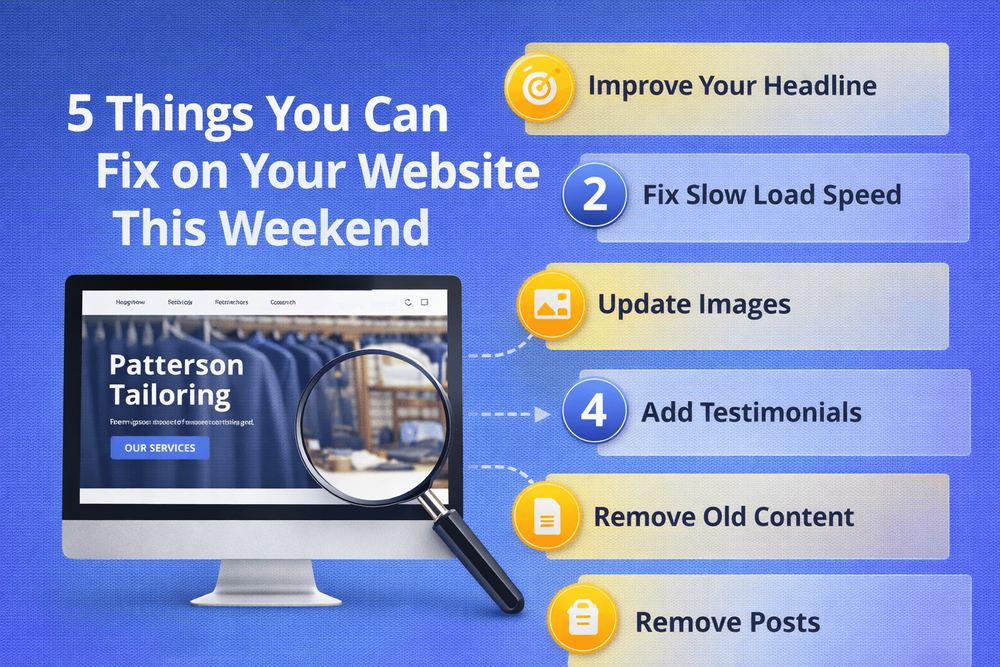
5 Things You Can Fix on Your Website This Weekend
You don't need a redesign to make your website work harder. Here are five quick fixes you can do this weekend without hiring anyone.
Quick answer
Make your phone number clickable We check this on every client site we review, and it's wrong more often than you'd expect. The phone number is there, but it's just text - not a link.
Key takeaways
- 1. Make your phone number clickable
- 2. Update your homepage headline
- 3. Add a call to action to every page
- 4. Check your site on your phone
1. Make your phone number clickable
We check this on every client site we review, and it's wrong more often than you'd expect. The phone number is there, but it's just text - not a link. On a mobile phone, that means the visitor has to copy it, switch to their dialler, and paste it. Three steps instead of one. Most people won't bother. A clickable phone number is a two-minute fix that removes a real barrier to getting in touch.
While you're at it, check where your number actually appears. We've seen sites where the phone number is only on the Contact page. If someone lands on your homepage - which most visitors do - and they're ready to call, they have to go hunting. Put your number in the header or at the top of every page, and make it tappable.
If you're not sure how to make it clickable, most website platforms let you add a phone link. The format is simple: the number is wrapped in a link that starts with "tel:" so your visitor's phone knows to open the dialler when they tap it.
2. Update your homepage headline
We've lost count of how many small business homepages open with "Welcome to [Business Name]." It tells the visitor nothing they don't already know - they can see your name in the logo. Your headline should answer the visitor's real question: "Can this business help me with what I need?"
Think about the last time you searched for a service on your phone. You probably opened two or three sites and picked the one that immediately told you what they do. Your homepage headline is your three-second pitch. If it doesn't land, the visitor hits back and tries the next result.
A better headline talks about the customer, not the company. Instead of "Welcome to Smith Plumbing - Est. 2003," try something like "Reliable plumbing in Manchester - call us for a free quote." It's specific, it's helpful, and it gives the visitor a reason to stay. We've written more about this in our guide on why your homepage might be losing customers.
3. Add a call to action to every page
If someone reads about your services but there's no obvious next step, they'll leave without doing anything. Every page on your site should have a clear call to action - a button, a link, a phone number - that tells the visitor what to do next.
This doesn't need to be aggressive or salesy. A simple "Get a free quote," "Call us today," or "Book a consultation" is enough. The important thing is that it's visible without scrolling and that it stands out from the rest of the page.
Check each page on your site right now. If you land on a page and can't immediately see what you're supposed to do next, that's a page that's losing you potential enquiries. For more on how calls to action work and why they matter, take a look at our post on what a landing page actually does.
4. Check your site on your phone
Most business owners only ever look at their website on their office computer, on fast broadband. Their customers are finding them on a phone, on a bus, on 4G. The experience can be completely different. Open your site on your phone using mobile data - not Wi-Fi - and try to do the three things a customer would do: find what you offer, find your number, and get in touch.
One thing we always check on mobile: can you actually tap the buttons? We've reviewed sites where the "Get a Quote" button is so small on a phone screen that you need surgical precision to hit it. If a visitor has to zoom in to use your site, they'll go somewhere easier.
While you're there, time how long it takes to load. If you're waiting more than three or four seconds, your visitors are too - and research shows over half of them will leave before the page finishes loading. You can run a proper speed test for free at PageSpeed Insights.
5. Update the small stuff that makes you look outdated
Scroll to the bottom of your site. What year does the copyright say? If it's not 2026, update it. It takes 30 seconds and removes a signal that tells visitors nobody's paying attention.
Then scan the rest of the site for anything that's out of date. Old team photos of people who've left. Services you no longer offer. A blog section with three posts from 2020 and nothing since. A dead blog doesn't just look bad - it actively suggests the business might not be operating anymore. If you started a blog and stopped updating it, it's often better to remove the section entirely than to leave it as a monument to abandoned good intentions.
None of these fixes are glamorous. But together, they tell your visitors that someone's home, the business is active, and the site is worth their time.
What if you find bigger problems?
These five fixes are the quick wins - the things you can do this weekend without spending a penny or hiring anyone. But sometimes, working through them reveals deeper issues. Maybe the site is so slow that no quick fix will help. Maybe the layout is so dated that tweaking headlines won't be enough. Maybe you realise the whole thing just isn't working for you anymore.
If that's where you end up, don't panic. Start with our guide on how to tell if your website is costing you customers to understand what's really going on. And if you want to understand what your website should actually be doing for your business, Your Website Is Not a Brochure - It's Your Best Salesperson is a good place to start.
The important thing is that you've taken the first step. A website that works for you is better than a website that works against you - and sometimes that difference starts with a clickable phone number.
Made your fixes and want to know what else is holding your site back? We'll take a look and tell you straight.
Book a free consultationFAQ
What will you learn in "5 Things You Can Fix on Your Website This Weekend"?
Make your phone number clickable We check this on every client site we review, and it's wrong more often than you'd expect. The phone number is there, but it's just text - not a link.
Why is 1. Make your phone number clickable important?
Because it directly affects trust, message clarity, and conversion before someone contacts you.
What is the best first step?
Apply one practical change this week, measure the result, and repeat with the next highest-impact improvement.

Categories: General