How to Tell if Your Website Is Costing You Customers
Your marketing might be working fine. The problem could be what happens when people actually land on your website. Here are the warning signs to look for.
Quick answer
You're getting traffic but no enquiries One of the most common things we hear from new clients is "I've tried everything - social media, Google Ads, even flyers - nothing works." Nine times out of ten, the marketing is...
Key takeaways
- You're getting traffic but no enquiries
- Your website takes too long to load
- It doesn't look right on a phone
- There's no clear next step for visitors
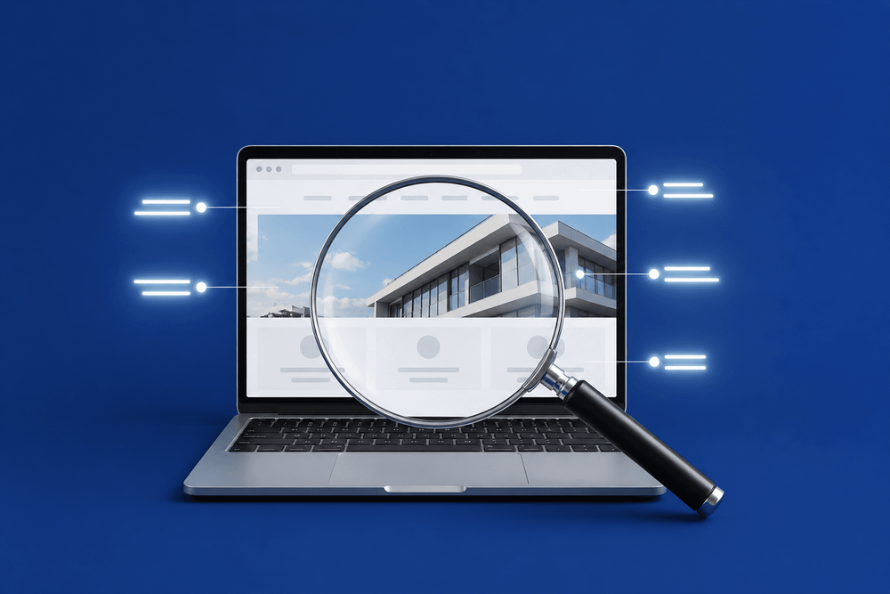
You're getting traffic but no enquiries
One of the most common things we hear from new clients is "I've tried everything - social media, Google Ads, even flyers - nothing works." Nine times out of ten, the marketing is doing its job. People are finding the site. But the site itself gives them no reason to stay or get in touch. That's not a marketing problem. That's a website problem.
We once reviewed a site for a small service business that was getting over 400 visits a month. Decent numbers for a local company. But they hadn't had a single enquiry through the website in three months. The traffic was there - the site just wasn't doing anything with it. No clear call to action, no reason for anyone to get in touch. The visitors were showing up and quietly leaving.
If you have Google Analytics set up, check whether people are visiting but not taking action. If you don't have analytics, ask yourself a simpler question: when was the last time someone contacted you specifically through your website? If you can't remember, that tells you something.
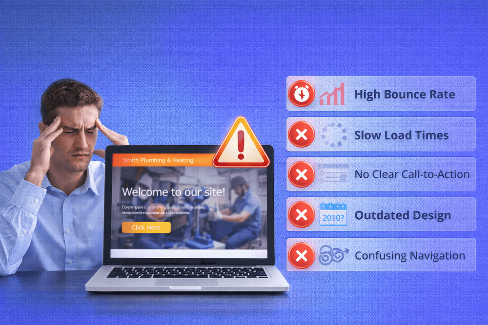
Your website takes too long to load
Here's a quick test: open your website on your phone right now, using mobile data rather than Wi-Fi. Count the seconds. If you're waiting more than three or four seconds for the page to look usable, your visitors are too - and many of them won't wait. We've seen sites that load fine on the owner's fast office broadband but crawl on a 4G connection, which is exactly how most of their customers are finding them.
Research from Google shows that over half of mobile visitors will leave a site if it takes more than three seconds to load. A one-second delay in page loading can reduce conversions by up to 7%. For a small business, that could mean losing one or two solid enquiries every week - not because your service isn't good enough, but because your website couldn't keep up.
We run every new client's site through Google PageSpeed Insights as one of the first things we do. The reaction is almost always the same - surprise. Most business owners have never tested their site's speed and don't realise how slow it actually is. A score of 30 or 40 out of 100 on mobile is more common than you'd think, especially on sites built with page builders or loaded with plugins.
You can test yours for free at PageSpeed Insights - it takes about 30 seconds.
It doesn't look right on a phone
More than half of all website traffic now comes from mobile devices. For local businesses, that number is often even higher - people searching on the go, looking for someone nearby.
If your website wasn't built with mobile in mind, your visitors might be dealing with text that's too small to read, buttons that are impossible to tap, or a layout that forces them to pinch and scroll sideways just to see your services. That's not just inconvenient - it makes your business look unprofessional.
Open your site on your phone and try to do the three things a customer would do: find out what you offer, see your phone number, and get in touch. If any of those take more than a couple of taps, you're losing people. And check that your phone number is actually clickable - if visitors have to memorise it and type it into their dialler, most simply won't bother.
There's no clear next step for visitors
Your website might look perfectly fine. Nice design, decent content, all the basics covered. But if there's no obvious thing for a visitor to do next, they'll leave without doing anything at all.
This is one of the most common problems we see. A homepage that talks about the business but never actually asks the visitor to take action. No "get a quote" button. No phone number in the header. No clear path from "I'm interested" to "let's talk."
Think of it this way - if a customer walked into your shop and nobody greeted them, pointed them in the right direction, or asked if they needed help, they'd probably walk back out. Your website works the same way. Every page needs a clear next step, whether that's calling you, filling in a form, or reading more about a specific service.
We've written about this in more detail in our guide on why your homepage might be losing customers and our explainer on what a landing page actually does.
Your content is about you, not your customer
We sometimes ask new clients to go to their homepage and count how many times the word "we" appears versus the word "you." It's usually not even close.
Homepage after homepage reads like an internal company profile - "we were established in 2005, we pride ourselves on quality, we offer a wide range of services." That's fine for an About page. But your homepage needs to talk to the visitor about their problem, not about your history.
Your visitor has landed on your site because they need something. Maybe their boiler's broken, maybe they need a new kitchen, maybe they're looking for a reliable accountant. They don't care - yet - about how long you've been in business. They care about whether you can help them. Lead with that, and the credentials will follow naturally.
A simple fix: rewrite your homepage headline so it talks about the customer's problem, not your company's story. Instead of "Welcome to Smith & Sons - 30 years of excellence," try "Need a reliable plumber in Leeds? Here's how we can help." One speaks to you. The other speaks to them.
It looks like it hasn't been touched in years
Scroll to the bottom of your website. What year does the copyright say? If it says 2021 or earlier, that's the first thing a savvy visitor notices. It's a small detail, but it signals neglect - and customers will wonder what else you've let slip. We've reviewed sites where the footer still listed a phone number the business hadn't used in two years.
An outdated website doesn't just look bad - it raises questions about whether the business is still active. If your site still features old branding, discontinued services, or team members who left years ago, visitors will notice. Fair or not, a dated website suggests a dated business.
You don't necessarily need a full redesign. Sometimes, updating a few key details - refreshing photos, correcting outdated information, updating the copyright year - is enough to show visitors that someone's paying attention. But if the design itself feels like it belongs to another decade, it might be time for a more serious conversation.
What to do about it
If you recognised your website in one or more of the sections above, don't panic. These are common problems, and most of them are fixable.
Some are quick wins you can tackle this weekend - updating a phone number, adding a call-to-action button, or refreshing an old copyright date. Others point to deeper issues with how the site was built, and those usually need a more considered approach.
The important thing is that you now know what to look for. A website that isn't working for you is a website that's working against you - every day, quietly, in the background. The sooner you identify the problem, the sooner you can stop losing the customers your marketing is already bringing in.
We've covered several of these topics in more depth across our blog. If your homepage is the issue, start with Why Your Homepage Is Losing Customers. If you're spending money on ads without seeing results, read 5 Things to Check Before You Spend a Penny on Ads. And if you're starting to wonder whether your website is really doing what it should, Your Website Is Not a Brochure - It's Your Best Salesperson is a good place to start.
Want to know exactly where your website is losing you business? We'll take a look and tell you straight - no sales pitch, no jargon.
Book a free consultationFAQ
What will you learn in "How to Tell if Your Website Is Costing You Customers"?
You're getting traffic but no enquiries One of the most common things we hear from new clients is "I've tried everything - social media, Google Ads, even flyers - nothing works." Nine times out of ten, the marketing is...
Why is You're getting traffic but no enquiries important?
Because it directly affects trust, message clarity, and conversion before someone contacts you.
What is the best first step?
Apply one practical change this week, measure the result, and repeat with the next highest-impact improvement.

Categories: General