Website Design for Freelancers: How to Win Clients Before You Get on a Call
A freelancer's website should do one job - convince the right client to book the call, already half-sold. Here's what actually works.
Quick answer
Most freelancers treat their website as a digital CV. Your website isn't there to list what you've done. It's there to get you on a call with the right clients, already half-sold.
Key takeaways
- The real job of a freelancer's website
- Pick a positioning and commit — and know what you're getting into
- The homepage in five parts
- The portfolio that actually converts
Most freelancers treat their website as a digital CV. Big mistake.
Your website isn't there to list what you've done. It's there to get you on a call with the right clients, already half-sold. By the time a good prospect lands on your site, the decision you want them making is "should I book them?" — not "are they even in the running?"
Here's how to build a site that does that work for you, whether you're a designer, writer, developer, photographer, consultant, or anything in between.
The real job of a freelancer's website
The biggest trap we see freelancers fall into is treating their site like a portfolio when they actually need a sales tool.
A portfolio says: here's my work, judge me.
A sales tool says: here's the problem I solve, here's proof I've solved it before, here's how we start.
Same projects, same photos, same testimonials — completely different result. Freelancers who make this shift typically see their inbound enquiries improve noticeably, because clients arrive to the call already half-convinced rather than still wondering if you're even worth talking to.
The difference shows up in small things:
- Portfolio mindset: a grid of 20 thumbnails with minimal context
- Sales mindset: five case studies that each tell a story — client, problem, work, outcome
Both show the same work. Only the second one sells it.
Pick a positioning and commit — and know what you're getting into
A lot of advice tells freelancers to "niche down" as if it's the only answer. Here's the honest reason that advice is so common: niching is the safer recommendation to give someone who doesn't have the knowledge to do broad well. Most freelancers who try broad positioning do it badly — and badly enough to hurt the business — so "niche down" has become the default safe answer.
Both strategies work. But they work for different reasons, and they have very different failure modes.
Niche positioning is easier to get right. You pick one specific type of client, you build the site around them, and you compete against a small number of specialists. The pricing is usually higher because you're the obvious choice. The main risk is picking a niche that's too small or shrinking — but execution-wise, it's relatively forgiving.
Broad positioning — done properly — is arguably a more powerful strategy. Volume, cost leadership, speed, accessibility. It scales further than niching ever can. But the execution bar is much higher, and the failure modes are more punishing:
- Cashflow discipline. Lower margins mean one slow month can sink you. You need real working capital and you need to know how much is enough.
- Cost control. You can't afford the software stack a specialist pays for. You need to know what you can cut without damaging the work.
- Operational efficiency. Broad only works if your delivery is fast and repeatable. If every project takes as long as a custom build, the pricing doesn't add up.
- Volume of proof. You can't rely on specialist credibility, so your social proof needs to carry real weight — consistent reviews, clear numbers, lots of satisfied clients across varied work.
- Clarity of offer. "I do web design" isn't broad positioning — it's no positioning. Broad has to be just as clear as niche: transparent pricing, defined scope, specific value proposition ("fast, affordable, professional" or "everything you need, ready in two weeks").
The reason niche is recommended so often isn't that broad doesn't work. It's that most freelancers trying broad copy the surface of it without understanding the mechanics underneath — they undercut on price without controlling costs, they promise fast turnarounds without a repeatable process, they try to serve "everyone" without clarity on what they actually do best. That's not a strategy. That's a way to run out of money in 18 months.
So the honest advice is this:
- If you're going to niche, commit to it. Name the client type on your homepage. Shape your portfolio around it. Charge the premium you've earned.
- If you're going to go broad, do it only if you know the strategy cold. Have your costs under control, your process repeatable, your pricing sustainable, your proof accumulating. If you don't — niche is probably the smarter first move until you learn the rest.
And if the broad path is genuinely what you want to take — go and research cost leadership strategies properly before you build the site around it. Read the case studies. Understand unit economics. Learn how high-volume, low-margin businesses actually make money (hint: it isn't by simply charging less). The freelancers who succeed with broad positioning treat it as a discipline to master, not a fallback for people who don't want to pick a niche. The ones who fail treat it as a default, and pay for that default with their business a year or two later.
The mistake isn't choosing broad. It's choosing broad without knowing what broad actually requires — and ending up with none of the upside of either strategy. Pick a direction, understand what that direction demands, and build the site around it.
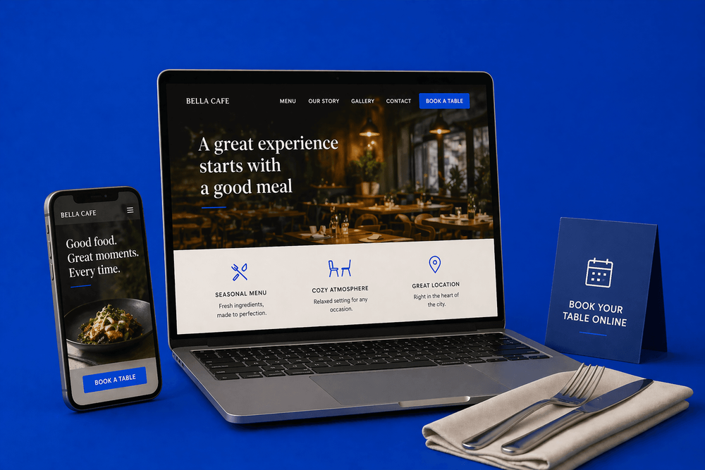
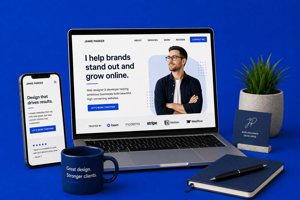
The homepage in five parts
Whatever your positioning, the structure of the homepage is roughly the same:
- Headline — what you do, for whom, with the benefit. Not "freelance designer." Something like "I design Shopify stores for independent fashion brands that actually convert," or "Fast, affordable websites for small UK businesses who need to start getting enquiries this month."
- Proof line — a quick credibility anchor. "10 years. 120 stores. £8M in client revenue." Or "Featured in [publication]. Clients include [names]." One line, specific, punchy.
- CTA — "Book a call" or "Get in touch about your project." Visible, one-tap, above the fold on mobile.
- Portfolio teaser — three to six projects, each with the client, the problem, the outcome. Not just screenshots.
- Social proof — testimonials with names, roles, and outcomes. Not "great to work with!"
Everything else — about page, services, pricing — lives on its own page behind a clear link.
The portfolio that actually converts
Three well-told case studies will outperform twenty thumbnails every time. We'd take a freelancer's site showing three projects — with the client, the problem, the work, and the outcome — over the same freelancer showing fifteen with just screenshots. One tells the visitor how you think. The other tells them you've had a lot of clients. Only one of those is going to help them decide whether to hire you.
The pattern we see on freelancer sites constantly is what we'd call the screenshot graveyard. A grid of 15 or 20 thumbnails, most of them looking broadly similar, none of them explaining what the freelancer actually did on the project or what changed as a result. From a client's perspective, it's almost impossible to tell whether the work was excellent or average — they can only tell that it exists.
A case study with "we rebuilt their Shopify store, conversion went from 1.8% to 4.2% in six weeks" does 50 times the selling that 20 grid thumbnails do, because it gives the reader a specific thing to imagine happening to their business.
Each case study should cover:
- The client — who they are, what they do
- The problem — what they needed and what was in the way
- The work — what you actually did, in plain language (not just "web design")
- The outcome — the result, in numbers if you have them, in words if you don't
If your portfolio is short on detail because you don't have permission to name clients, ask — you'll be surprised how often clients will say yes, especially if you frame it as a case study rather than a testimonial. And if you genuinely can't name the client, anonymising still works: "A London-based restaurant group" tells a reader more than a screenshot and "Project 04."
Trust signals — where the real work happens
The testimonials we see on freelancer sites are mostly useless. "A dream to work with." "Really easy going." "Super talented." None of these is a testimonial — they're character references. They tell a potential client nothing about what will change for their business if they hire you.
A testimonial that actually converts looks like this:
"Sarah rebuilt our site and our booking rate went from 12 a week to 28 a week in two months."
Specific client. Specific outcome. Specific number. When a prospect reads that, they're imagining the same thing happening to their business. When they read "really easy going," they're imagining nothing at all.
How to get better testimonials, even if you're new
Beginner freelancers always tell us they don't have strong testimonials yet because they've only worked with a few clients. Fair. But most of the time the problem isn't the client count — it's that they asked the wrong question.
"Would you mind writing me a testimonial?" produces bland character references because clients don't know what you want.
"What changed for your business because we worked together?" produces outcome-driven quotes because you've given the client a specific thing to think about.
One email per client with the better question often produces testimonials that earn you thousands in new work. If a client struggles to come up with an outcome, prompt them with examples: "Did bookings go up? Did the site feel easier to update? Did you save time? Is there a number you can share?"
Other trust signals worth adding
- Client logos — a row of recognisable names (with permission) carries weight even without a quote
- Press mentions — if you've been featured anywhere legitimate, say so
- Numbers — "120 projects delivered" or "£2M in client revenue" or "clients in 8 countries" gives a scale marker
- Certifications and memberships — where relevant to your field
- LinkedIn recommendations — embed or screenshot the best ones; they have inherent credibility because they're tied to real profiles
The About page — the other page that actually matters
Most visitors to a freelancer's site will check the About page. Not for your CV — for whether they want to work with you. This is where personality matters, and where too many freelancers default to bullet-list boredom.
Good freelancer About pages:
- Tell a story — how you got into this work, why you care about it
- Show personality — you're not a corporate brand, don't sound like one
- Include a photo (yes, really — clients want to see who they're hiring)
- Explain who you work with — and, crucially, who you don't
- End with a clear next step
Bad freelancer About pages are a list of qualifications and a generic "I help businesses grow." Nobody cares. The About page is where you get to be a person, not a service provider. Lean into it.
For more on the copy side of this, our guide on how to write website copy that converts covers the principles in depth.
Services and pricing — the transparency question
Should you list prices on your site? It's a bigger debate than it sounds. The three options:
- Full prices listed. Best for productised services (e.g. "Shopify store: £2,800"). Filters out bad-fit clients before they ever hit your inbox. You lose some enquiries you'd have closed at a different number — but you save far more time.
- Starting prices. "From £2,500." Gives an anchor without committing. Good compromise for most freelancers doing semi-custom work.
- No prices, form only. Usually the worst option. Attracts tyre-kickers, wastes time on enquiries you'd never have taken, and creates awkward "what's your budget?" calls that could have been avoided.
For most freelancers, at least a starting price helps massively. It qualifies prospects before the call, saves time on both sides, and removes the awkwardness of pricing negotiations happening via email.
The contact process — remove every point of friction
A freelancer's contact page should be the easiest thing in the world to use:
- Short form. Name, email, what you need. That's it. Resist the urge to add "how did you hear about me" or "what's your budget" fields — those are questions for the call, not for the form.
- Optional: a calendar link. Calendly, Cal.com, or SavvyCal for a 15-minute discovery call. Let prospects book themselves in.
- Clear expectations. "I'll respond within 24 hours." "I take on 2 new clients a month." "My next availability is [month]."
- A phone number or WhatsApp. If that fits your style and your clients — some still prefer a voice conversation to starting with email.
Special cases by freelance type
Different types of freelancer have different emphases:
- Designers: the work is the work — show it well, but don't skip the About page. Your personality is part of what's being hired.
- Writers and copywriters: show results (conversion uplift, SEO wins, engagement stats) not just writing samples. The sample is the work; the outcome is the proof.
- Developers: problem → solution is more important than the tech stack. Clients hire you to solve the problem, not to use a specific framework.
- Photographers: the gallery is the pitch — but captions and client credits matter. Show context, not just images.
- Consultants and coaches: trust signals and authority markers carry the most weight. Testimonials from recognisable names, published articles, speaking engagements, specific client outcomes.
Whatever the discipline, the principle is the same: your website's job is to remove doubts and answer questions before the call, so the call is about "how we start" — not "are they any good?"
Common mistakes we see on freelancer websites
- Portfolio thumbnails with no context — the screenshot graveyard
- An "About" page that's a bullet list of skills
- No testimonials, or testimonials that are just character references
- No prices, no process, no idea what working with you is like
- A site designed to impress other designers, not to convert clients
- Being undifferentiated — not specialist enough to be a specialist, not clear enough to be a strong generalist
- Stock photos of "professional" people instead of a real photo of you
- Contact forms with 12 fields
The bottom line
A freelancer's website isn't a CV. It's the conversation that happens before the client ever gets on the call with you. Done well, it filters out wrong-fit clients, pre-sells right-fit ones, and makes the first call feel like the start of a project rather than a pitch.
Pick a positioning — specialist or broad, both can win — and build the site around it. Turn your portfolio into case studies. Ask clients for outcome-focused testimonials. Be a real person on the About page. Put a price on the thing, even if it's a starting price. And make the contact form short.
Do those things consistently and the website will start doing what a freelancer website is actually meant to do: bringing you clients you want to work with, before you've even introduced yourself.
Is your freelance site actually selling you — or just showing your work? Book a free consultation. We'll take an honest look and tell you the two or three things most likely to bring you better-fit clients.
Book a ConsultationFAQ
What will you learn in "Website Design for Freelancers: How to Win Clients Before You Get on a Call"?
Most freelancers treat their website as a digital CV. Your website isn't there to list what you've done. It's there to get you on a call with the right clients, already half-sold.
Why is The real job of a freelancer's website important?
Because it directly affects trust, message clarity, and conversion before someone contacts you.
What is the best first step?
Apply one practical change this week, measure the result, and repeat with the next highest-impact improvement.

Categories: Industry Guides